Thursday, June 7, 2012

Final Project: LA County Station Fire

Reference Map


Thematic Maps: The LA Station Fire and Significant Ecological Areas 

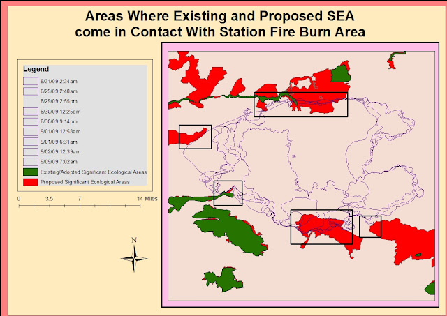
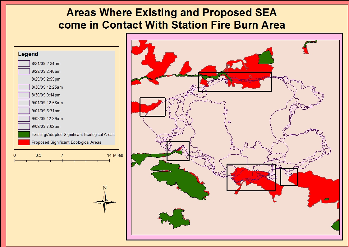
This map shows how the fire spread outward toward Significant Ecological Areas.


Report

The Station Fire that occurred in the Los Angeles National Forest in August and September of 2009 was one of the most devastating fires that burned through California's wildlands that year.The fire started out relatively contained to one area. The burn area is undeveloped, but not far from populated Los Angeles suburbs such as Glendale, Montrose, and La Canada Flintridge. The fire perimeters on the map show that the fire spread hourly, often expanding many square miles outward in a brief time. The time lapse between the first and second burn area perimeter is only about twelve hours, so it is apparent that the fire was moving rapidly. The most notable expansion of the fire took place on August 30. The burn area doubles in size expanding in a north east direction. The fire expanded quickly but remained in the relatively vast space between Palmdale, La Canada Flintridge, and Agua Dulce. The lack of development in this region is likely due the higher slope that is visible compared to other regions in Los Angeles County.

The theme of the map is the spatial relationship of Significant Ecological Areas(SEA) in Los Angeles County to the fires and how they were affected. Significant Ecological Areas are regions within Los Angeles that have been surveyed and deemed ecologically important. These sights are not established preserves, but land and water sources that support valuable habitat.The program is a part of the Los Angeles County General Plan Conservation/ Open Space Development through the county Department of Regional Planning. It began in the 1970s but new research is mapped consistently, providing people with a visual display or important habitats in the county. The SEA have the goal of protecting fragile environments and the habitat of the species, sometimes endangered, within them.The maps in this project show where existing ecological sites were established as of 2010, one year after the Station Fire, as well as the locations of proposed SEAs made in 2011. This thematic map allows the reader to see that the fire was fought in a way that protected the county's SEA. This is apparent in the large SEA located southwest of most of the burn area. It is likely that this was due to concern over human populations and structures such as homes more than the Significant Ecological Areas. The few areas where the fire extended into the existing and proposed Significant Ecological Areas is also mapped. Most of the the Significant Ecological Areas in close proximity to the fire escaped without burning. Given the fire spread pattern, any more expansion in the north direction could have damages an SEA or significant ecological site(lacounty.gov). 

My hypothesis is that fire is not the main threat to ecosystems and that the Station Fire was not the largest threat to existing or proposed Significant Ecological Areas in Los Angeles County. The map of existing Significant Ecological Areas was created in the year following the Station Fire. The closest SEA to the fire lies on the outermost edges of the burn area, with none in the middle. The Department of Regional Planning has not deemed the majority of the burn area as significant, which is interesting because it is a large area of open land, free of major development. One reason for this is that fire is a natural occurrence in this type of Western United States forest, chaparral, and shrub ecosystem(Noss).The people deciding the location of the SEA may not see these areas as needing to be protected because they have just undergone a natural process. Another idea for the lack of spatial relationship between the Station Fire and SEA is that fire eliminated the biodiversity necessary to be a Significant Ecological Area in the burn area. Sometimes after fires wildlands have trouble returning to their natural state because of changes in conditions: "ash and sediment runoff into waterways, predation in the open habitats, invasive species including weeds and pests, browsing and grazing of regenerating vegetation,inappropriate fire regimes" (www.dse.vic.gov.au). These factors may cause the region to no longer be significant to the county, but even harmful to nearby wildlands. A very practical analysis would be that the fire was contained before reaching major ecological areas. With time conditions became less hot and windy, and more funds came in to help fight the fire(Garrison, Zavis, Mozingo). 

 Proposed Significant Ecological Areas appear to be located in areas where development will take place. This is visible in the included map showing major roads in Los Angeles County. Many of the proposed and existing SEA are closer to more metropolitan areas, but are also almost non existent because of these roads. This leads to another hypothesis that development is more detrimental to Significant Ecological Areas than wildfires. There is a lack of SEA in the southern portion of Los Angeles County. However the maps show how many major roads and highways are located in this region. Roads and highways are indicators of development and high population, but they have consequences such as erosion, runoff, and isolating fauna(enviroment.fhwa..dot.gov). Due to these regions already being urbanized, the potential Significant Ecological Areas in this region of the county are already gone. The lack of any SEA being located where the majority of roads are shows how development hurts ecological areas.

Based of the maps I created I conclude that areas considered Significant Ecological Areas will continue to expand. In just one year the area between the existing and proposed SEA grew dramatically. The Proposed SEA map already expands more into the burn area of the Station Fire. With wild fires being an issue that has only been getting worse(Keeley, Forthingham, Morais), and SEA expanding, the two are likely to overlap more in the near future. In urban cities like Los Angeles, growing populations mean that development expands outward. This means that more homes, roads, and businesses will be constructed on California's wildlands. This is dangerous because these areas are prone to small natural fires(Noss). It also eliminates the homes of flora and fauna native to the region. These species are important to the ecological functions in the environment of Los Angeles County. The full consequences are unknown until too late, when the entire county is developed. It is very important to have an understanding of Significant Ecological Areas in any location. This becomes even more important in an area prone to fires. The fire did not spread far into the highly sloped area of the county, and none of the sloped area is included in the significant ecologic areas as well. The fact that the region surrounding the fire is hilly could have helped protect the SEA. It is less likely that the sloping region will be used for homes and structures over flatter areas. This could help the burn area from the Station Fire grow and help the species in this area recover from the fire. Another reason that the fire seemed to spread in the opposite direction of development is because more was done to ensure the safety of these structures. The priority of the fire department is first to protect people, but then to protect structures such as homes and schools. Because the majority of the counties population is located south of the fire, this region was held while the fire expanded outward. It is obvious that Significant Ecological Areas will never compete with human lives and expensive structures in need for protection. However, it is important that people do begin to understand just how important they are for environmental processes.

The thematic maps show that the number of significant ecological sights will be growing. This thematic map is important in understanding how to fight future fires. These areas need to avoid the intensity of fires like the Station Fire, so the map helps the state understand where to take precautions against future burning. Fires are not the only threat to these lands. Developed area, expressed by highways on these maps, are relatively absent of SEA except for area trying to survive around the edges. Geographic information systems and programs like ArcGIS are important in improving these environmental issues. Mapping the area shows the entire extent of the fire on individual days. It helps understand what makes the fire grow, as well as teach lessons on how to better contain it in the future. With the SEA, mapping is important in monitoring where fragile environments are. These maps help urban planners decide how to urbanize areas with convenience to people while trying to minimize damage to ecosystems. The areas deemed Significant Ecological Areas contain resources or habitats that are crucial to the entire ecosystem. In a place that is extremely developed and always evolving like Los Angeles, it is even more important to map, monitor, and preserve these areas.

Works Cited
Boxall, Bettina, and Julie Cart. "As Wildfires Get Wilder, the Costs of Fighting Them Are Untamed." Los Angeles Times. Los Angeles Times, 27 July 2008. Web. 6 June 2012.
Franklin, Jerry F., William L. Baker, Tania Shoennagel, and Peter M. Moyle. "Ecology and Management of Fire Prone Forests of the Western United States." Ed. Reed F. Noss. Society for Conservation Biology Scientific Panel on Fire in Western U.S. Forests (2006): n. pag. Web.
Garrison, Jessica, Alexandra Zavis, and Joe Mozingo. "Station Fire Claims 18 Homes and Two Firefighters." Los Angeles Times - California, National and World News - Latimes.com. N.p., 31 Aug. 2009. Web.
"Investigation under Way into Cause of Station Fire." CNN. N.p., 01 Sept. 2009. Web. 12 June 2012. <http://articles.cnn.com/2009-09-01/us/california.wildfires_1_angeles-national-forest-fire-officials-fire-chief-mike-dietrich?_s=PM:US>.
Keeley, Jon, C.J. Fotheringham, and Marco Morais. "Reexamining Fire Suppression Impacts on Brushland Fire Regimes." Science Vol. 284.No. 5421 (1999): 1829-832. Print.
Levin, Myron. "Conference to Discuss Ecological Areas." Los Angeles Times. Los Angeles Times, 06 Dec. 1990. Web. 7 June 2012.
Longcore, Travis. "Ecological Effects of Fuel Modification on Arthropods and Other Wildlife in an Urbanizing Wildland." (2003): 111-17. Web. 7 June 2012.
"Los Angeles County Department of Regional Planning." SEA Program. N.p., n.d. Web. 11 June 2012.
Meyn, Andrea, Peter S. White, Constanze Buhk, and Anke Jentsch. "Environmental Drivers of Large, Infrequent Wildfires: The Emerging Conceptual Model." (2007): n. pag. SagePub. Web. 12 June 2012.
"Natural Environment Recovery." Natural Environment Recovery. N.p., n.d. Web. 10 June 2012.
"Wildlife and Habitat." Environmental Review Toolkit. N.p., n.d. Web. 125 June 2012. 


Monday, May 28, 2012

Lab 7

2000 Census Population Distributions by County


This map shows the distribution of the black population in America during the 2000 Census. The darkest colors on the map represent the densest populations. According to the data, the majority of "Black Alone" populations in America are located in the South. High percentages of people identified as "Black Alone" live in Louisiana, Mississippi, Arkansas, Alabama, Georgia, North Carolina, and South Carolina. Low percentages of "Black Alone" populations live on the western side of the United States, especially in states such as Arizona, Utah, Idaho, Wyoming, and Montana. Counties in southern states have much higher populations of individuals considered "Black Only." Populations in California are slightly higher than the rest of the Western states.This population distribution could support understanding of American history settlement. The government may use distributions like this to relate information such as education and employment rates to see if there are correlations between races and other variables. Many corporations use data information like this to help understand how they want to market products and where.


This map exhibits "Some Race Alone" from the 2000 Census. This cateory is more broad than the other two categories because it encompasses more than one race. According to this map, "Some Race Alone" populations are located predominantly in the Southwest. There are few "Some Race Alone" populations East of the Mississippi River, and the highest recorded populations are genrerally in the southern half of the United States. The East coast has a few higher populations located on coastal states, especially Florida. The densest populations are represented by the darker colors in the legend:blue, purple, and pink. These three shades run along the United States-Mexico border. The higher populations along the border may be correlated to the geographic location. Due to the location of the highest populations, I wonder if "Some Race Alone" involves many immigrants who have settled in places like New York City, Florida, or the Southwest. Some interesting notes are the higher populations in Washington state-Idaho region. The color contrasts on this map help visualise the differences between the dark areas where Some Other Race populations are high compared to where the hue is light and less populated.


This map shows the Asian population in the United States based off of the 2000 Census. The map shows that the Asian population is predominantly and almost entirely located on the West Coast. The Asian populations in 2000 are almost located entirely in California. The darkest shade of blue represents the largest population percentage and these are located in southern and northern California. The middle shades of blue cover much of California, showing a relatively high percentage of Asians compared to other states. Most of the country is green, representing a relatively low percentage of Asian population. It is interesting that the Asian population of the United States is relatively small compared to the other two races represented in this project. Like "Some Race Alone," the Asian populations are dominant in the West. However, Asian populations are almost entirely in California and do not have he range of "Some Race Alone." This distribution could also represent American settlement history, with many Asian populations crossing the Pacific Ocean into California. It would be interesting to compare these numbers with the most current census to see if there has been population change. 


Concluding Thoughts and Overall Impression

The maps in this lab show very clear population distributions. From this lab it is very clear to see that high percnetages of Asian populations are in California, black populations are predominant in the South, and "Some Race Alone" is a category that is dominant in the Southwest. These distributions are important in helping understand the cultures, traditions, and values in each state and see if there is a correlation with race. This kind of data is used to understand voter choices, as well as help companies decided where to place products and how to advertise them there. The disributions represent historical settlement patterns and show how people have very much remained in the location where their ancestors landed.Using dark colors to represent populations is a very good tool for representing dense populations. This way map users can scan maps and have a clear understanding of what they are looking at. Contrast between these colors also helps create a clear understanding of spatial differences.This census map series was very interesting because it included information that is relevant to my understanding of my home country and state.

My overall impressions of GIS are that it is a very complicated subject. After this project, I do think that I am becoming more confident using the software. GIS is a very important tool in our constantly changing world. It allows spatial information to be up to date, but can store old information to keep track of what has changed. One fear is to mess up one step while making a map, because the whole project can be ruined. At first I had difficulty understanding how to join the layers and saving the Excel Charts. With each project , after a few trials it becomes easier to do apply the steps. There are ways that the map maker can influence people to think about maps. For instance these maps could likely be used in modern immigration debates. I enjoyed making these maps because they are very realistic to an assignment someone with a career in GIS might receive. Census information like this is exactly what GIS is best at showing. I would like to continue using GIS for these kinds of distributions. As a visual learner, GIS spatial distributions like these make demographic information more interesting.


Tuesday, May 15, 2012

Lab 6

These maps show 3 different aspects of the same region in South Dakota: the aspect, slope, and elevation.

These next images are a 3-D model of the same area of land shown in the three maps above. All of them show the same area, I just rotated the map to see different angles and different color gradients.


When thinking of American topography most people probably imagine the great Rocky Mountains going down through the country, or even the Sierra Nevada's of California. People most likely don't picture the middle of the country. So when deciding where to locate my map I decided to pick an mountainous place that is also very important to American history. The Black Hills of South Dakota were home to Native Americans, sight of Native American and settler conflict, and home to a mining boom. One of these famous mining cities Deadwood was the setting for the Hollywood film, Calamity Jane starring Doris Day. Famous landmarks in these mountains which rise out of the Great Plains and stretch into Wyoming are Crazy Horse, and Mount Rushmore. The extent of my map in decimal degrees was 0.017453292519943295. The geographic coordinates are as following: North(top) 44.6799999998, West(left)-104.4025, East(right)-103.4925, and South(bottom)44.1927777775. These topographical maps are very helpful in understanding elevation. The most manipulative is the 3-D model because the mapmaker could use a scale that could make the elevation, lope, and aspect look much steeper or smaller than it is in reality. I enjoyed this lab, because these kinds of topographic maps are more visual than those with contour lines. It is interesting to see such detailed views of a region. These detailed visuals are enhanced by the bird tool while making the 3-D model.

Monday, May 14, 2012

Lab 5: Map Projections

Map projections are a very interesting aspect of geography. They are necessary for understanding spatial information. However, this lab shows how varied maps really are. Though all six of the projections shown above are measuring the distance between the same cities, the actual measurements in miles varied. The most similar distances were measured on the conformal projections. The widest gap in measurements were between the equidistant maps. Though different types of projections may seem inconsistent map projections are very important. They are the best and easiest way for humans to access and understand spatial information. Different projections provide the viewer a way to look at the world from different angles. This is a healthy way to see the layout of the land, because looking at the traditional map can limit full understanding of Earth. The projections in this project showed me that I have been deceived by different projections my whole life. The perceived distances are very different depending on what type of map is being looked at. The projections I measured all said the distance between Washington D.C. and Kabul, Afghanistan were in the 8,000 or 9,000 range. These numbers do not seem to far apart in terms of world distance, but when I apply it to driving, going 10 miles is entirely different than driving 1,000 miles. This shows how much the type of projection influences the information of the map.

There are several dangers in relying on map projections because they cannot be assumed completely accurate. As discussed in class, map projections can give a false image of certain places. Growing up,I always thought that Greenland was much larger than it is. Later, I found that this was a result of the projection. However, not until this class did I realize how many types of projections exist. These three categories of projections show the earth in different ways. Distortions on maps can effect how people perceive different places. Distortions of maps can also tell a lot about the maker of the map. The Mercator map in many ways  does not show Africa to it's true size. This is because the map was created by Western men who thought highly of Western Europe but did not have concern over Africa. The peril in these manipulative uses of maps are that they could be used for negative things, such as influencing people into acting certain ways politically. If Sarah Palin claims she can see Russia from her house than people are going to panic and want to be more armed against Russia. This type of spatial hype was exploited very much during the Cold War and Cuban Missile Crisis to stir up an emotional response of Americans.  Falsities in size and location are the danger that map projections pose.

The benefit of projections is that they allow people to view the entire world in a 2-D format. Even if they are not the most accurate size and placement, projections can give people a general understanding of the globe. Humans are spatial creatures and knowing our location is very helpful. Projections allow humans to understand culture through the proximity of places to each other and their location in the world. Projections can be helpful for anything from charting a vacation to marking areas engaging in war. I think as technology advances, more projections will be released with more accuracy and updates. Examining projections really helps educate individuals in world spatial information, which is very important and should be part of mandatory curriculum. By knowing where countries, resources, landmarks, and many other map features, a person becomes more well rounded and understanding of global issues. The nature of projections allows them to be distributed widely. They can be sent anywhere from the most renowned universities to small village schools in developing countries. The universal nature of them has the potential to promote a more unified and understanding world. Maps have the potential to promote better relationships between countries and a more educated population.

The most confusing projection to me in my examples is the oblique Mercator. It is difficult to see where this type of projection would be more useful than the other projections, or even another conformal projection like the stereographic projection featured. The equal area maps I selected were the most similar to eachother in terms of looks. Both of these maps were my favorite because they followed the clearest form of the whole world that I am familar with. When I use maps these are similar to the types of projections I would use. I use maps everyday so I need to be aware of what kind of projection I am looking at. However these maps are guilty of projecting the world as the way we always see it. The map is useful to me because the way the countries are included is the way I have always been shown the world in projections. However in class we discussed how projections are a human construct because humans decided how they want to look at the world. This standard set up shows North America and South America on the left side of the map, while Asia, Australia, Europe, and Africa are on the right side. The world did not have to be drawn like this, but this decision was made and it is accepted as correct. The class looked at the upside down map of the world. It is confusing to look at since I have been so conditioned to view the world in the placement that the graticule and conformal projections show. Map projections are helpful and important, but it is important to remember that they can be flawed or distorted.

Monday, May 7, 2012

Lab 4: Proposed Airport Expansion

Lab 4 was very challenging for me. I have no GIS experience, and do not consider myself to have very advanced computer skills. Some of the initial challenges with the lab were tasks like finding the proper tool bars and saving the files to my travel drive. For a majority of the lab, I felt like I was just just completing steps but I did not really understand what exactly I was doing to the maps. Once the lab instructed me to start giving descriptive labels to the Table of Contents, each layer on the map's meaning began to make more sense to me. Another difficult aspect of this lab was that there were so many steps in each of the 5 parts. With so many steps, and similarities within them, it is easy to miss one direction. With such a long assignment there was no room to just "play around" with the software to better understand it. The problem is that missing just one instruction can result in the entire lab being incorrect. Even right as I was completing the lab, I had to ask someone to help me understand how to save my work as a Jpeg image. After doing this once I am hoping that the process is ingrained in my memory. Another change in this lab from the last was the lack of creativity needed to construct the Airport Expansion Map. In the previous labs I got to decide what I was mapping but in this lab a very practical selection was made for the class. I will need to work much more with ArchMap before I consider myself to be comfortable with the program.

It does seem that with time I will become more comfortable with ArchMap. As I get used to working with the layers and familiar with the toolbars, I am hoping that I am not so afraid to make mistakes. It was especially daunting in a lab with this many steps to make one wrong move. I have used PhotoShop before so applying layers was similar but ArchMap can involve many images, where in PhotoShop only one final image is being created. One thing I like about ArchMap is that it completes all computations and lines for the user. This makes less room for me to make an error because the program is working like a fact checker. The good thing about this particular assignment was that much of the information was already located within the program, I just had to find it. I'm assuming that with more experience I will begin entering more of the data  myself. For instance the shape of the county already existed in the program, but I wanted to make a map of my hometown, I would have to create the shape of the city on my own.This makes the maps more credible than a human could complete on their own. Toward the end the lab started requiring the user to repeat some of the steps used earlier without reexplaining them. With a quick glance for memory, I was able to duplicate the steps. I look forward to using this program in the future to make more fun types of maps like the ones the class looked up for the first lab. Those maps are the ones that are fun for me to look at and GIS provides the opportunity for these maps to be created and distributed online.

This lab did give me more insight into the reality of GIS and how it works. It showed me how GIS can be very useful in any spatial design. Since so many layers can be added a great assortment of data can be compiled in one place.GIS has potential to be the entire future of spatial information as society turns more paperless. The data has the potential to share more information in one place where people would otherwise have to research resources. I think learning how to work with programs like ArchMap is very beneficial to students because it the direction that technology and society are moving. The only dangerous thing of learning one program like ArchMap is that in the technology sector, everything is always rapidly evolving. One week a certain program is the standard, the next weekend it is outdated. Hopefully the skills learned using ArchMap create a foundation for using a variety of GIS programs. Places where I see GIS being important in the future would be industries like National Security. GIS programming can be used to show old information and simultaneously make minute to minute updates. Another similar industry that GIS could potentially strengthen is air travel. With the amount of data programs like ArchMap can handle, hopefully it can be used by airlines to increase flight safety and limit air traffic confusion. The potential of GIS really does seem limitless as it will become more advanced and be used for everything from consumer studies to solving global issues such as disease and war.

There are potential pitfalls relying solely on GIS. In the ArchMap program it seems as though it may be very rigid in what can and cannot be done. GIS may also not be entirely user friendly for everyone. I am usually good at understanding maps, but GIS can get so technical that the person trying to use it may not understand all parts. GIS may be seen as the future of mapping, or the most accurate, but in many cases I think I would just opt for a traditional map. One pitfall discussed in class was aggregation and distortion problems. It is important to remember that even with a digital program humans can manipulate data to look the way they want it. Though GIS is used for the mapper to be very creative, in this lab I felt very limited. This uniformity seems necessary though to see if I really used the program properly. I liked that the ArchTutorial included step by step pictures so I could make sure I was using the write tools and completing each step correctly. Without these images and other students to reassure me, I am sure that much of the information would have gone over my head and I would have missed steps. Another limitation of GIS is that it is restricted to those who can afford the software. I assume that elaborate technical programs like ArchMap are not cheap to purchase. Computer programs like PhotoShop are very pricey so the intended market cannot be that large. Fortunately being a student, I get to use this program through the school. However after the class, if I wanted to continue working with ArchMap I doubt that I would be able to purchase the software for myself. GIS programs are very cool but there are flaws that need to be examined before looking solely to GIS in the future.

Tuesday, April 24, 2012

Week 3: Neography

Neography is when people make their own maps using an existing toolkit. The lab describes neography as having three distinct parts in its definition. The first is sharing location information with friends and visitors. The second is helping shape context, and the third is conveying understanding through knowledge of place. Even the lab acknowledges that the idea of people creating their own maps is fun. People can have personalized and creative ways to express different regions and what they offer. However the idea of Neography has potential pitfalls.

The first aspect of geography described is mostly positive. By people sharing location information with friends and visitors, people learn about other places. This could increase tourism to various parts of the world. However there are some pitfalls within this aspect. People are subjective and the way they convey a location on a personalized map may not encompass an entire location or represent it a certain way. Another potential hazard of this, is physical danger of people actually knowing where you are all the time. People could stalk individuals, or break into their homes if they know they are away.

The second aspect has more potential pitfalls. Maps are looked at as a source of safe information. People expect information on maps to be valid. Neography seems like it would be the Wikepedia of maps. If everyone has access to mapping a location, the context of a place could be very biased or misrepresented. People would use them, and enjoy them as resources, but their validity would be questionable.

The third idea which is that neography could expand individuals knowledge of place also has potential and pitfall. If people are interested in a certain subject matter, then they are more likely to look at a map. For example, someone who loves the show Survivor may not have looked at a map, but since the neography below is directly geared toward their interest they may examine the map and gain a better understanding of place. The pitfall is that I made this map. I am new to this material and there could be flaws in the map if they are looking for exact coordinates or locations. Neography expands knowledge of place, but there could be flaws or bias in these personalized maps.

Below I have used neography to create my own map of the different locations where the American show Survivor has been filmed.


View Survivor Locations in a larger map

Tuesday, April 17, 2012

Week 2: USGS Topographic Maps

1. The quadrangle name is Beverly Hills, CA.

2. The adjacent quadrangles are Canoga Park, Van Nuys, Burbank, Topanga, Hollywood, Venice, and Inglewood.

3. The topography was compiled in 1966.

4. North American Datum of 1927, and North American Datum of 1983 were used to create the map.

5. The scale of the map is 1:24,000. One inch represents 24,000 inches or 2,000 feet.

6.
a. 1,219.2 meters
b. 1.8939 miles
c. 2.64 inches
d. 12.5 centimeters

7. The contour interval on our map is 20 feet.

8.
a. Public Affairs Building
Latitude 34 degrees 4'30" N or 34.075 degrees N
Longitude 118 degrees 26'25" W or 118.45 degrees W
b.Tip of Santa Monica Pier
Latitude 34 degrees 0'45"N or 34. 01 degrees N
Longitude 118 degrees 30' 50" W or 118.55 degrees W
c. Franklin Canyon Reservoir
Latitude 34 degrees 7'15" N or 34.1 degrees N
Longitude 118 degrees 24' 55"W or 118.35 degrees W

9.
a. Greystone Mansion: 480 feet or 146.304 meters
b.Woodlawn Cemetary:140 feet or 42.672 meters
c.Crestwood Hills Park: 620 feet  or 188.976 meters

 10. The Beverly Hills Quadrant is in UTM Zone 11.

11. The UTM coordinates in the lower left side of the map are 376300 N and 362000 E.

12. 1,000 meters X 1,000 meters= 100,000 square meters

13.


14.  14 degrees/249 MILS

15. The water in the stream between the 405 Freeway and Stone Canyon Reservoir flows from north to south. We can assume this because the northern end of the stream is at a higher elevation than the southern part of the stream.

16.